
Decoding The International Football Map
- Joani Radhima
- Mar 28, 2021
- 2 min read

The first step towards our goal is understanding the data and finding ways to visualize the patterns in them. An overview of the group's progress until now is presented in the image below and the link leads to the Miro board itself.
Overview
https://miro.com/app/board/o9J_lN0IeIE=/
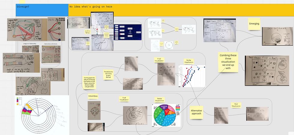
Some interesting sketches that we thought of in in the process until now are presented below.
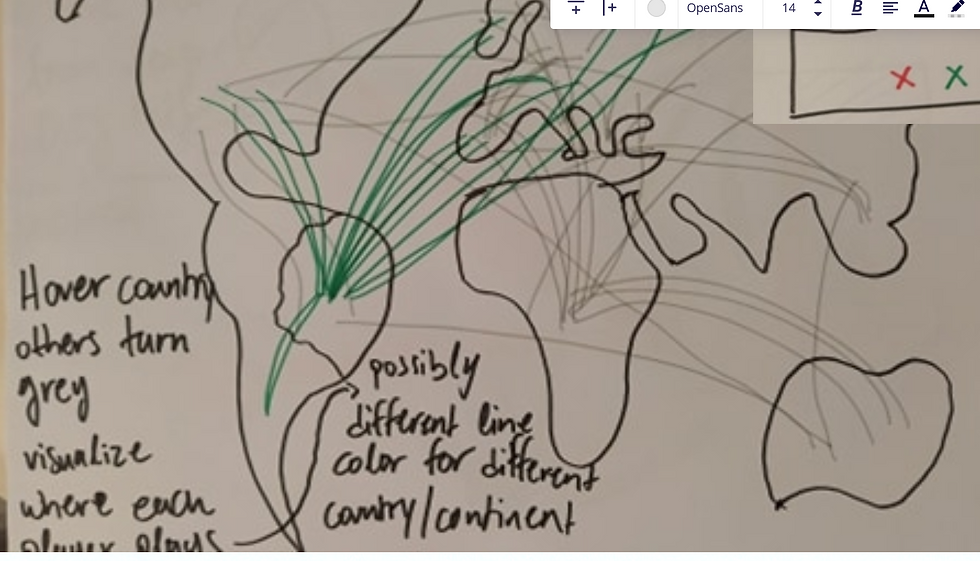
As an introduction to our dataset, a world map with links between a player's birth country and the country they play in, like visualizations of flights from and to airports, can help us in two ways: a country with high arrow density can be either a great player "factory" or a big league. When pointing at a country, arrows not including it can turn grey and its arrows get colored so we can see the destinations of the players.
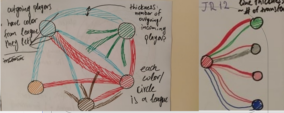
A way to visualize the transfers between the leagues can be shown in the sketch below. Leagues are visualized with nodes and transfers with links. A link is colored by the leaving league and pointing at a link can show a tooltip with information. This graph can also indicate the power dynamic between leagues, where, for example, players going from the Premier League to Serie A can have a higher mean age and value than the other way around.
If the graph get's too convoluted, we can have multiple versions of the sketch on the right.
A question we had was about the distribution of nationalities across each league, and how different league can be more/less international or prefer different nationalities. A modified barchart as below has two channels: the amount of back area represents the % of native players in each league, while the part that's left can be colored depending on the other nationalities. The bar's length can possibly represent another value.

Another way of visualizing aggregated values is through coloring the background of a symbolic shape. For example, we can have a colored rectangle behind Italy representing the Italian league, where the area covered by each color represents a factor level. Another example could be the sketch on the right where we show the percentage of each nationality from the players wearing number 9 on their shirts (Blue country has more than double the players with #9 than Grey country).

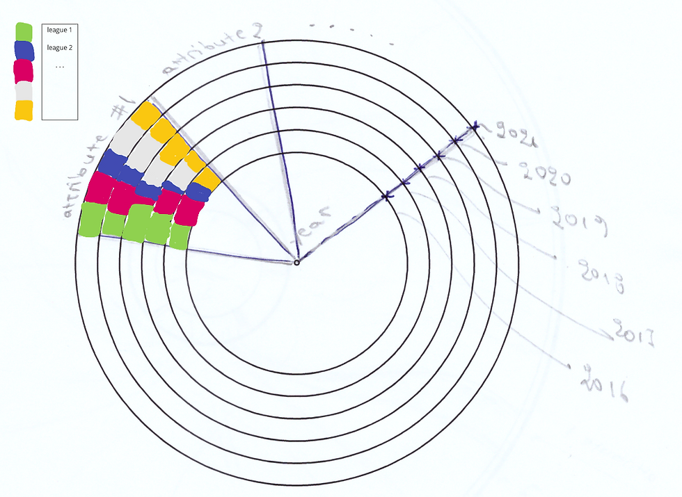
An interesting chart we thought of, which was inspired by a visualization we found online, can be seen below. In it, every concentric circle represents a year of data, each pie slice represents an attribute of the players in the data (attacking, passing, speed, etc) and the colors represent the different league we will focus on (possibly the big 5).
These visualizations are just the beginning of what we are working on. The dashboard is in a state of chaos at the moment. An upcoming post will probably clarify things a lot.


Simfwna me tous ipologismous mou, etouto edw anevike me to pou teleiwse to epeisodio me to party tis enwsis tou survivor